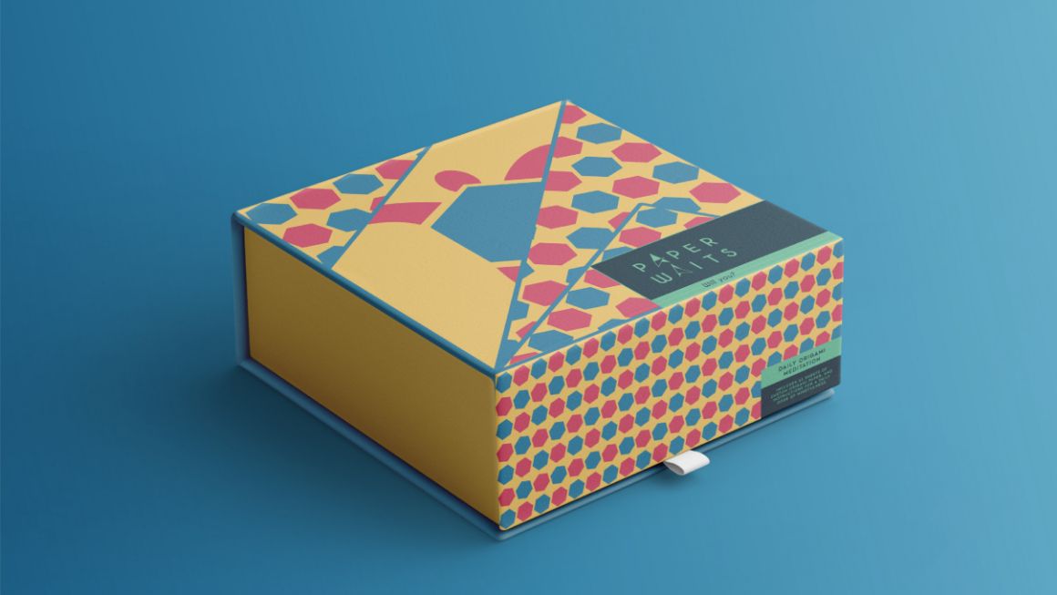
The presence of patience is the absence of frustration. Paper Waits is a recurring mindfulness package, in which the users practice unique origami patterns on custom printed paper, with the goal of taking time every day to sit and practice mindfulness.
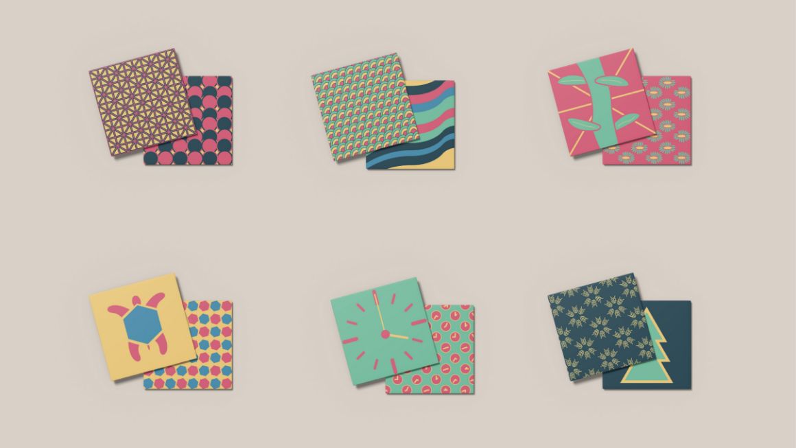
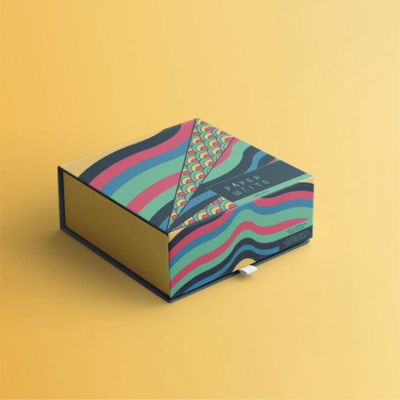
Each paper pattern released with Paper Waits acts as a reminder of patience; connections, baby turtles heading to the ocean, time, salmon swimming upstream, pollination, and growth.
This corporate branding is for an Ontario cannabis retailer, and utilizes an elegant repeating “drop” motif to spell out the company name, and is complimented with a weighty retro typeface; a leather brown, and a warm gold complete the look.
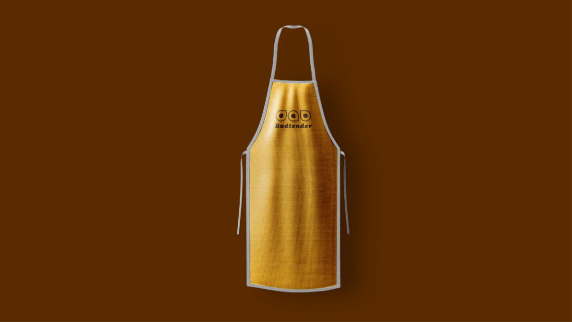


The challenge in this project is making recreational cannabis fun, elegant, and approachable to a wider audience. The balance was struck once the logo took on such a simple life.

Countless Culture is a challenge in developing a corporeal brand that speaks to the attitude of counter cultures past, in the age of disembodied subcultures; the solution was to make something that speaks to the unpromising state of the world.
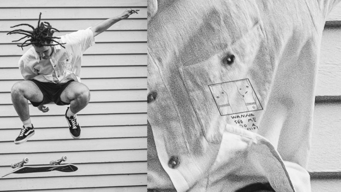
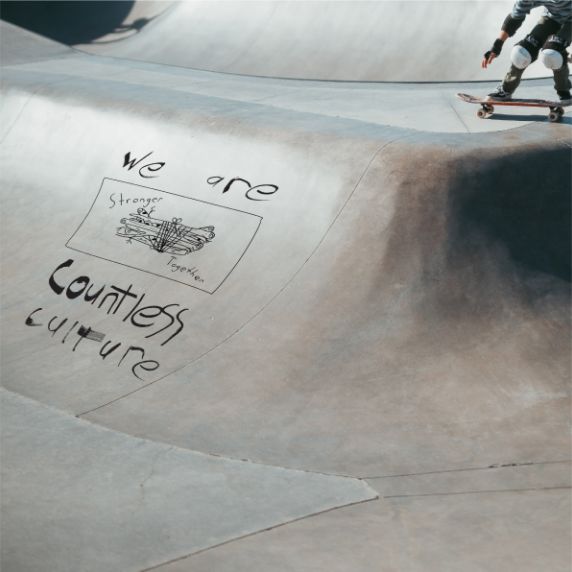
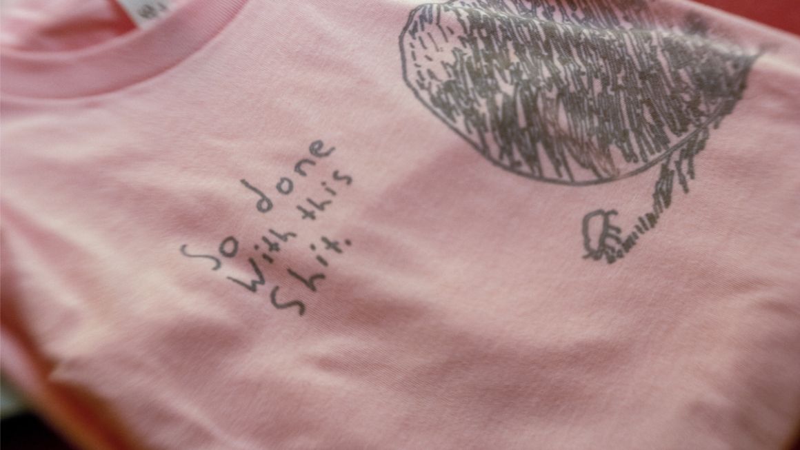
Through the three pieces chosen for release, Countless Culture states that it’s just as fed up with the state of the world as everyone else is, reminds that coming together in spite of this has power, and that perseverance is key to growth.
