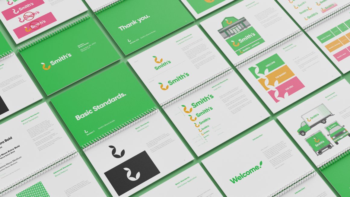
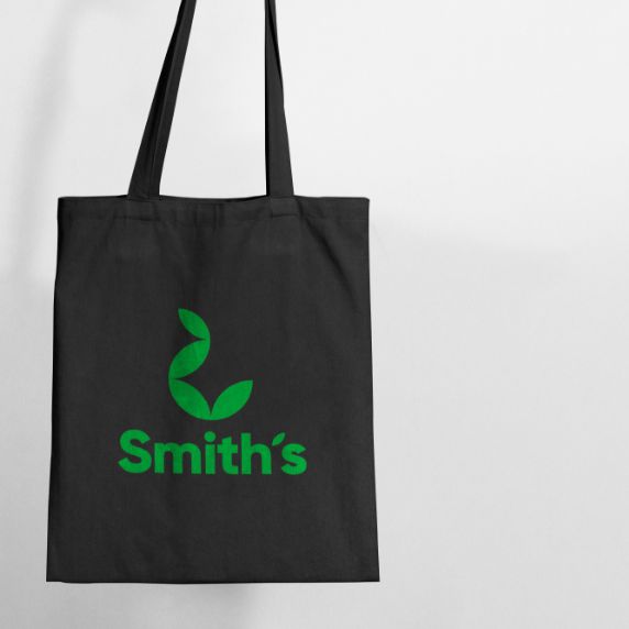
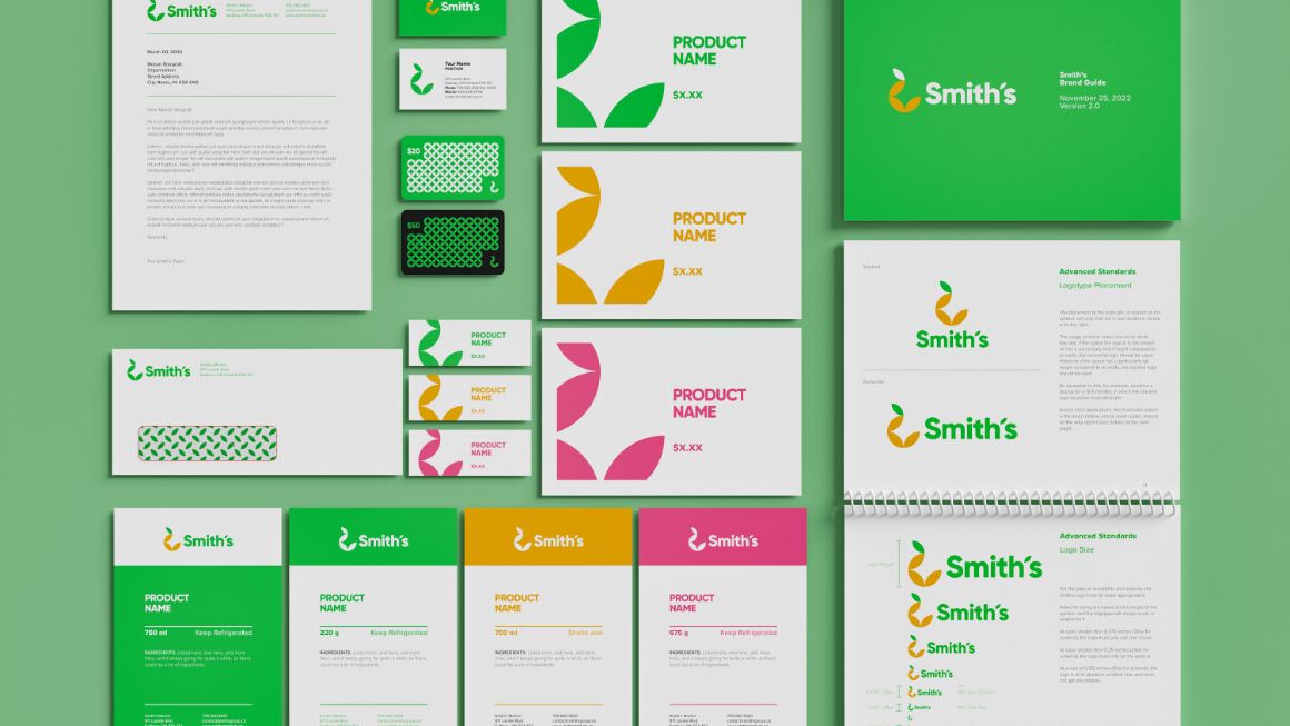
This refreshed visual identity system for Smith’s Market ensures the brand stands for quality and freshness, and broadens the scope of its offerings beyond merely produce. The logo represents quality with its geometric shapes, and a natural, healthy outlook with its organic curve. Applications are practically limitless, and the systems for consistency solve the problems that their previous identity had struggled with.


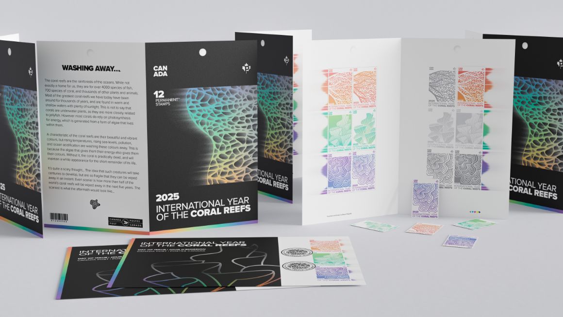
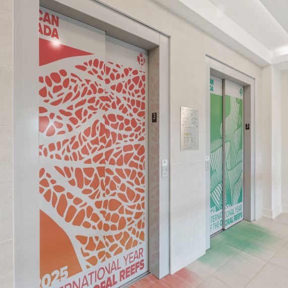
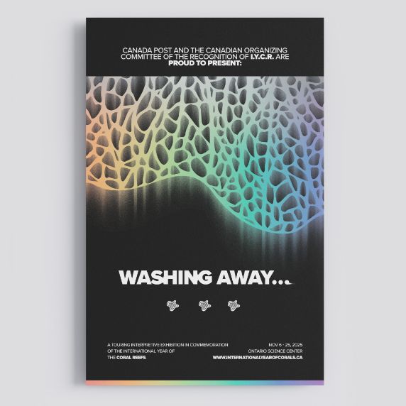
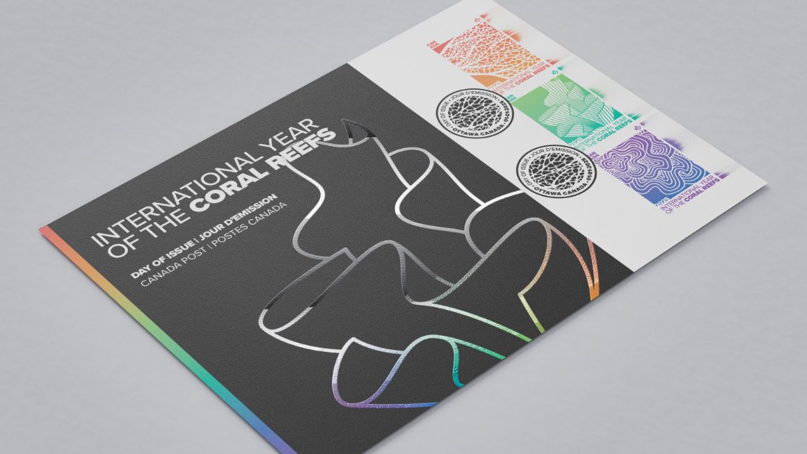
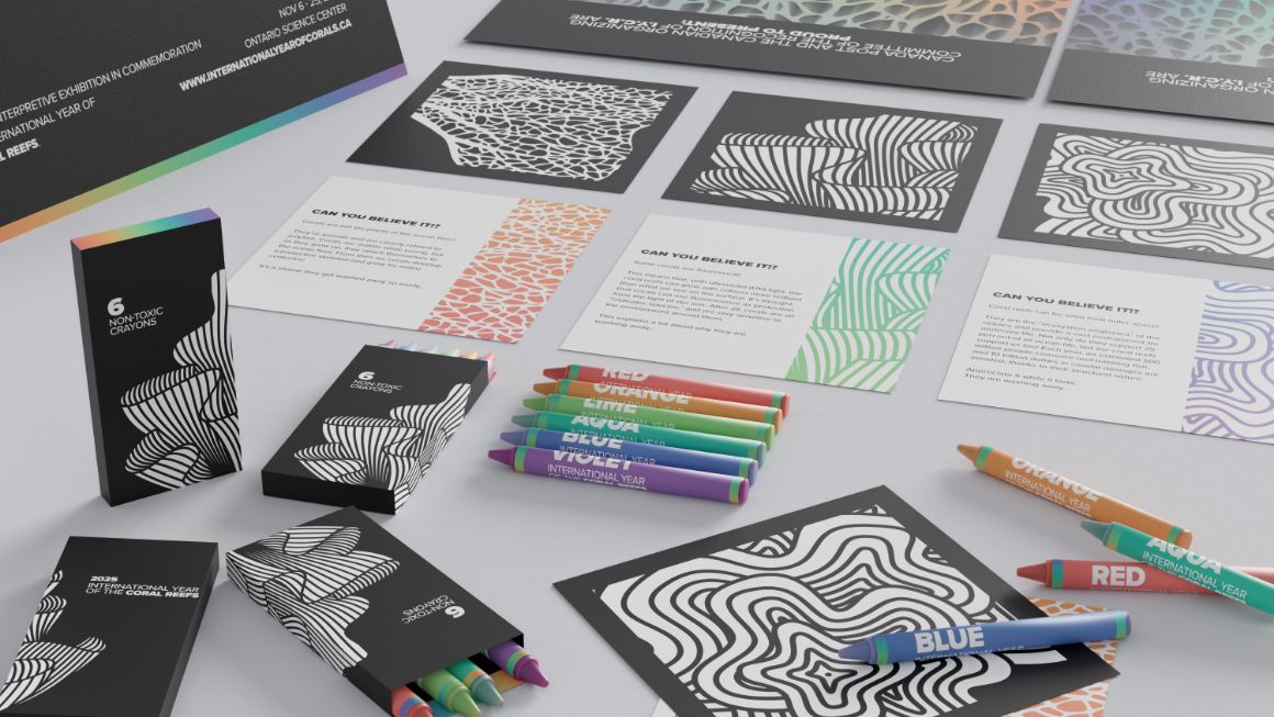
‘Washing Away’ recognizes 2025 as the “International Year of the Coral Reefs” through commemorative postage stamps, a first-day cover, a branded event, and more. The campaign is highly thematic, and visually reinforces its message through a metaphor of colours washing away; a fate for many dying corals.
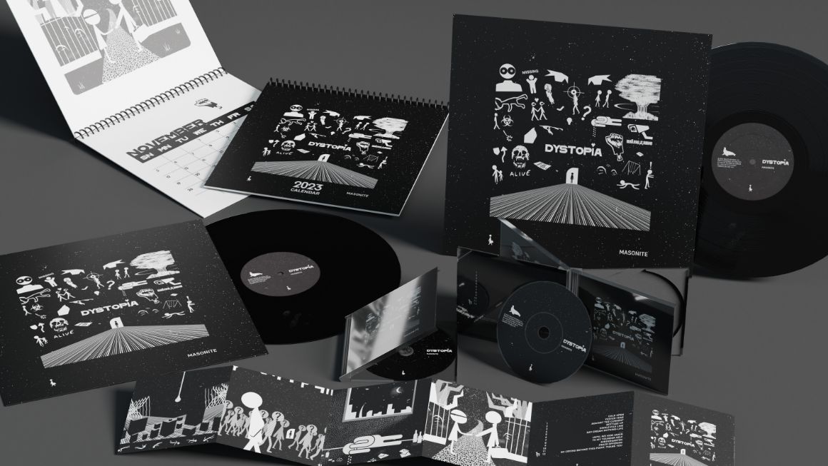
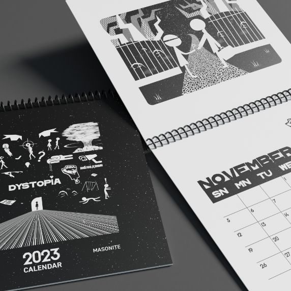
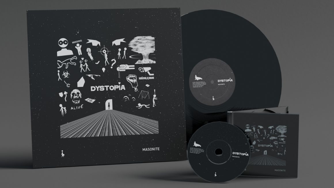
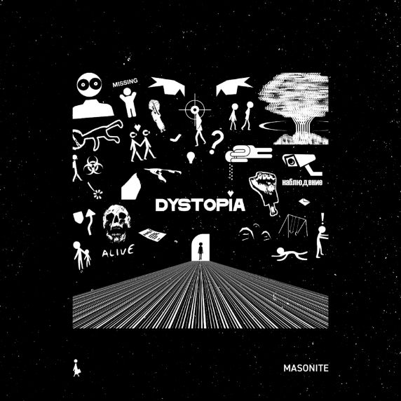
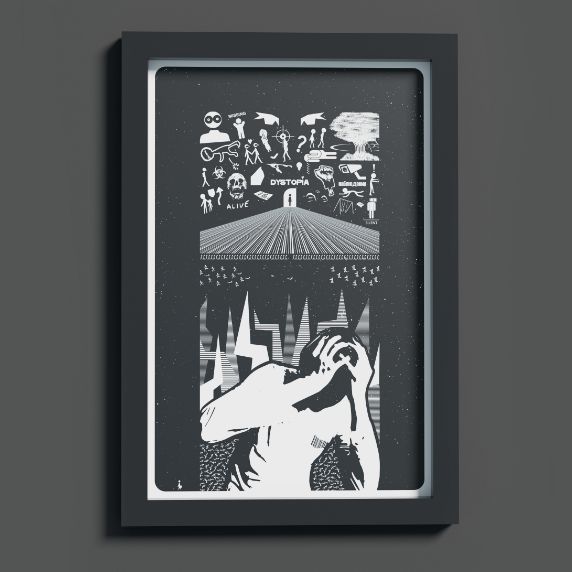
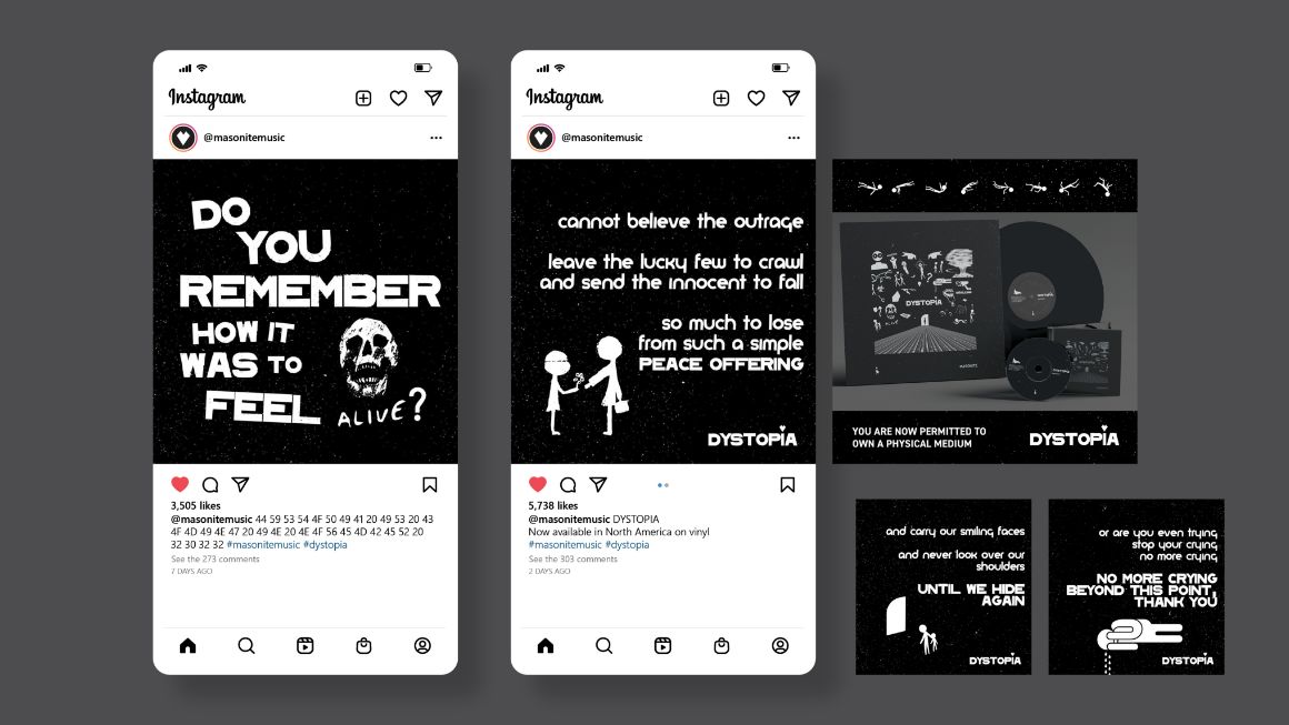
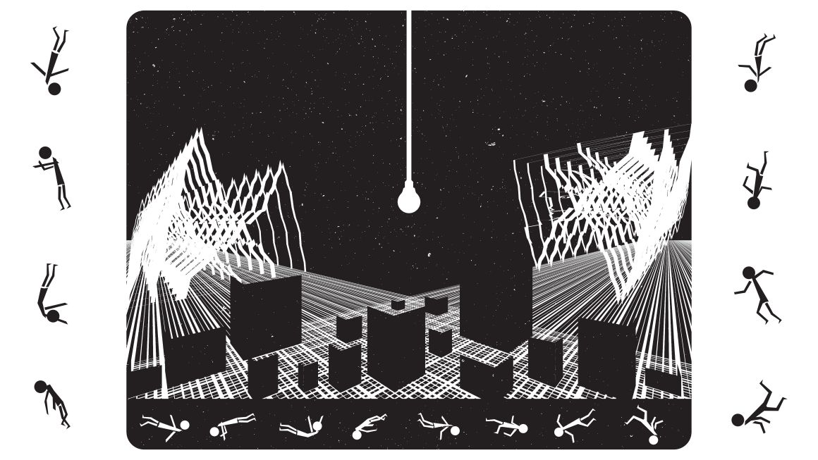
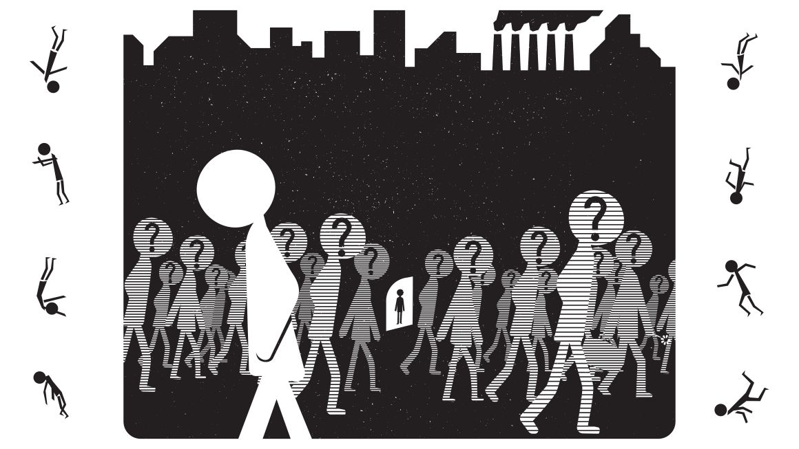
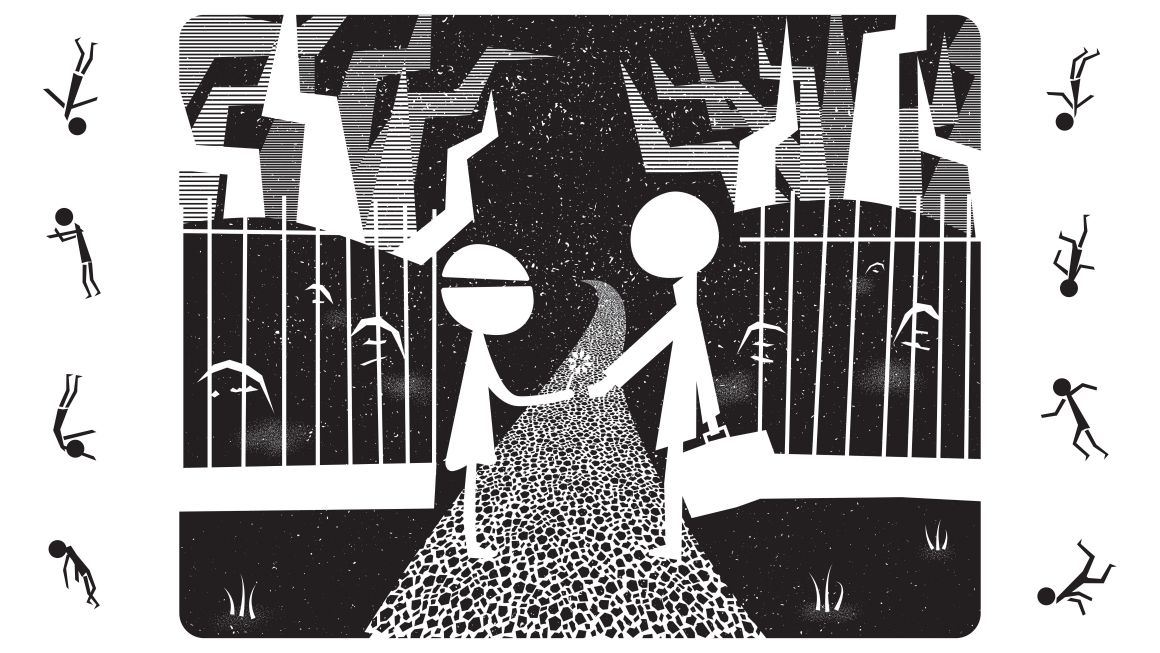
DYSTOPIA is a concept album and art collection that is chock-full of depth, meaning, and symbolism. The twelve artworks add layers to the music on the album and help build a world to be interpreted. From there, other elements were designed, all while keeping its artistic integrity consistent. Various details are hidden throughout, waiting for the consumers to decipher it. Featured items include a vinyl record, a CD, a themed calendar, and a poster.