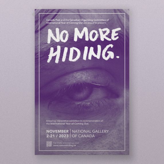
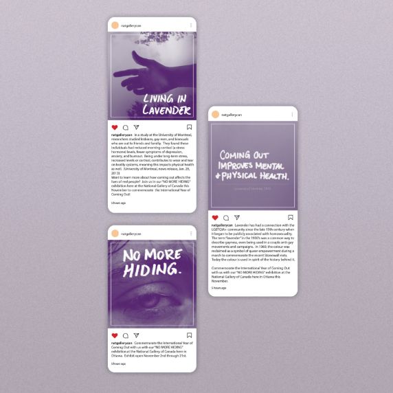
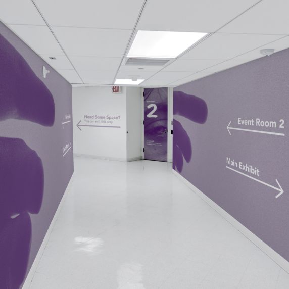
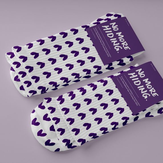
This project is an exhibition for the International Year of Coming Out. The design concept centers around closeup photography in monochrome purple with handwritten captions, this evokes emotion, visualizing the difficult feelings someone has when they are faced with coming out.
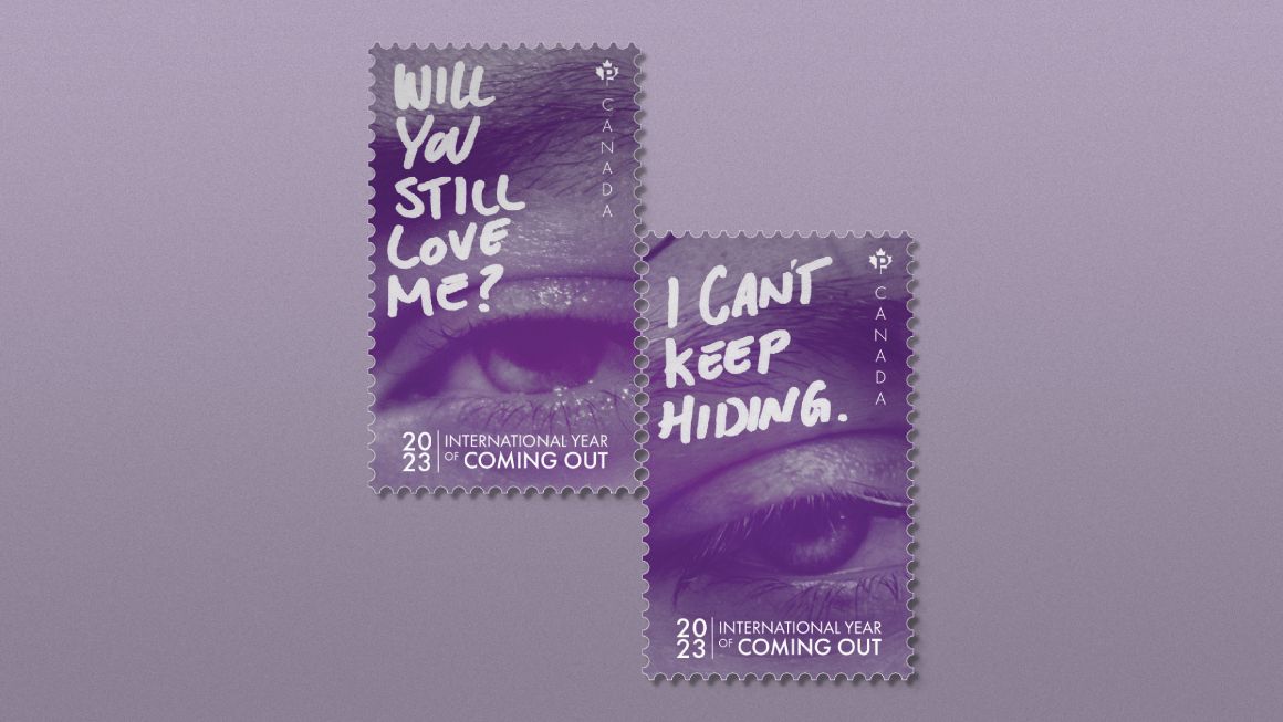
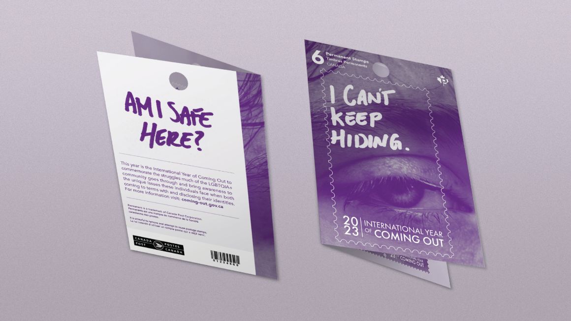
Purple was chosen as the monochrome palette given the long-standing history of association lavender has with the LGBTQ+ community.
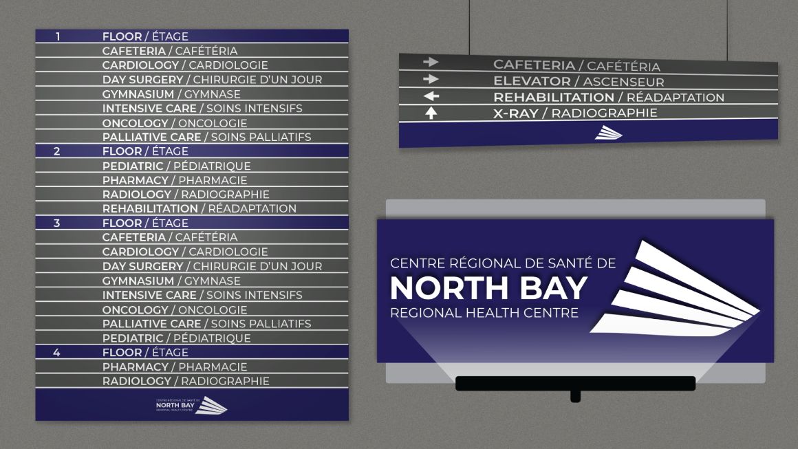
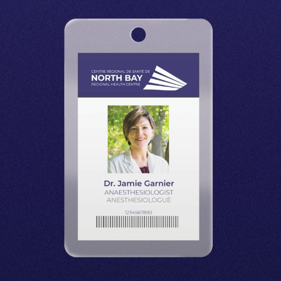
This project is an exploration redesign for the visual identity of the North Bay Regional Health Centre. This redesign incorporates the likeness of the wood awning at the main entrance to the hospital building. It is a unique shape which appears welcoming and optimistic.
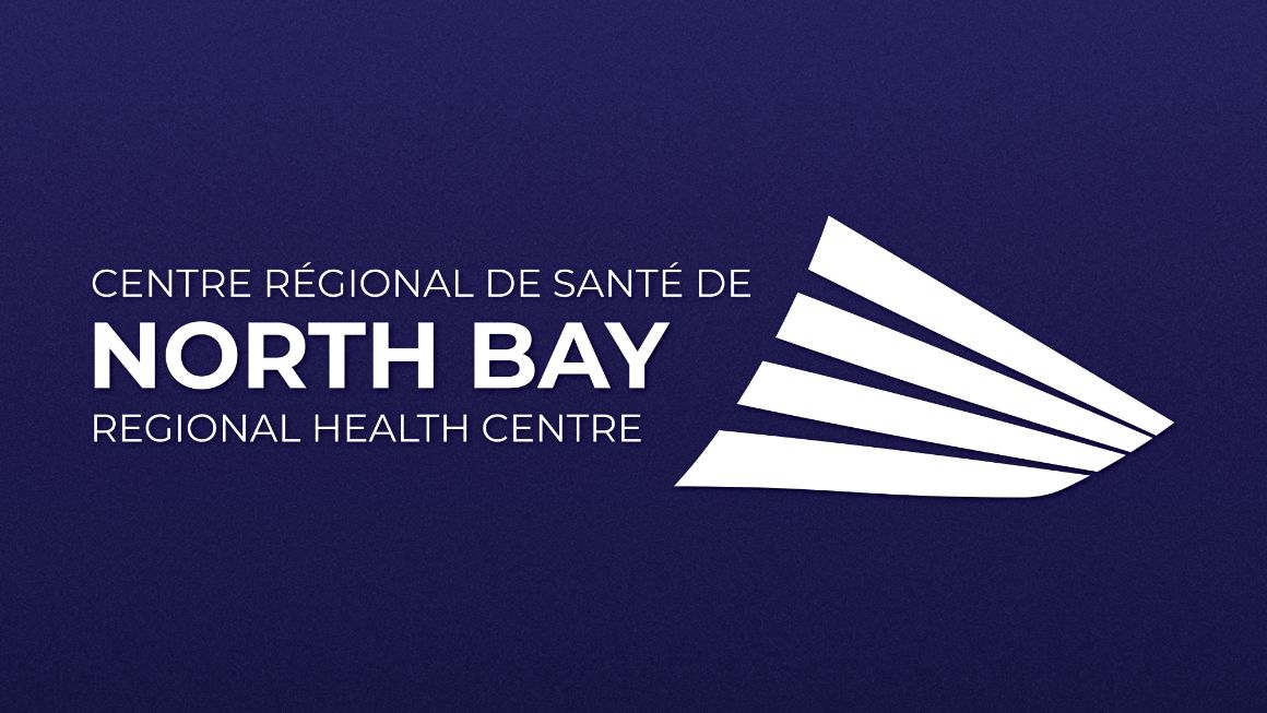
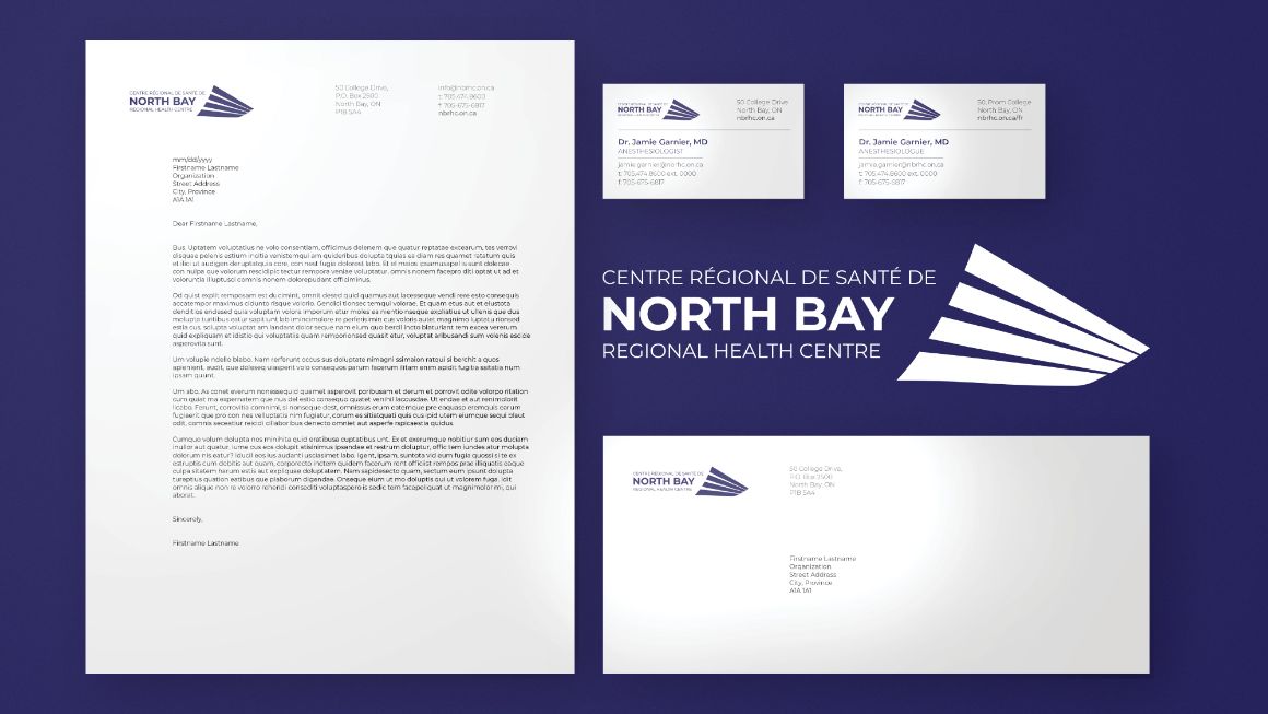
Navy blue was selected as the primary brand colour for its association with trusthworthiness and sincerity, important considerations for the healthcare field. Overall, the deisgn is clean to communicate this further as well as aid in the readiblity of the content.

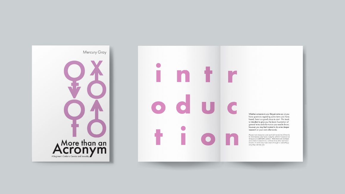
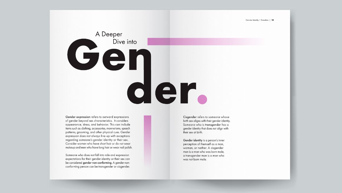
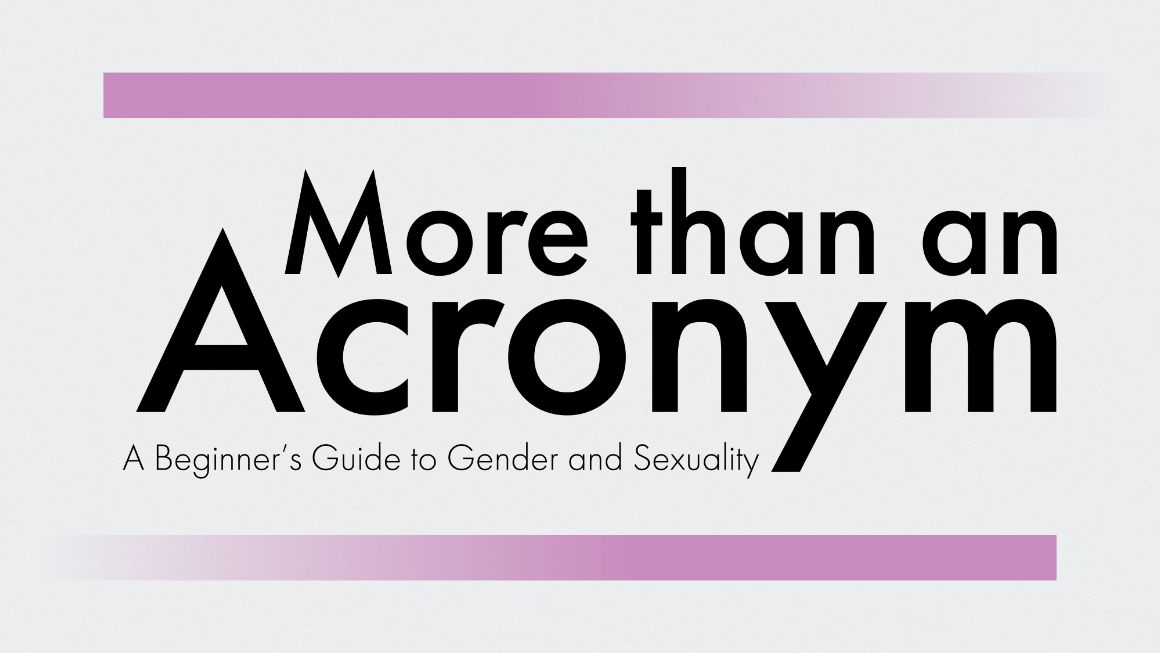
Many people do not know much about the LGBTQIA+ community, and this is not always out of lack of interest. Often, it can be difficult to know where to start learning. This book was created to be a resource that gives an introduction to a variety of topics people may be curious about in a form that is playful and easy to understand.
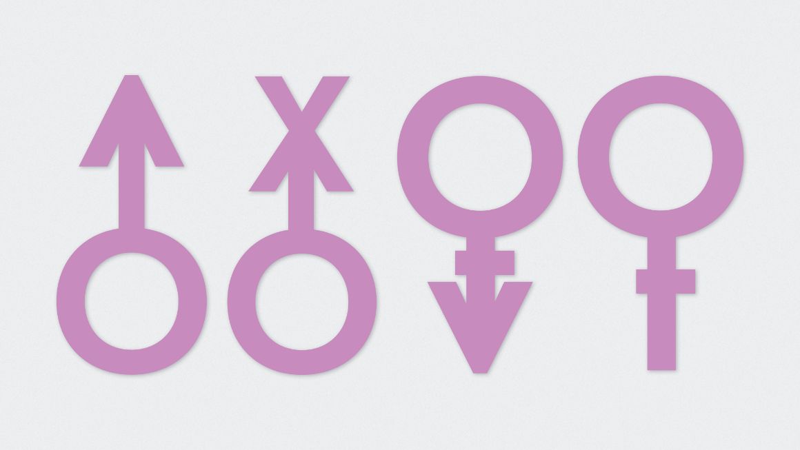
These gender symbols were created from Futura, the geometric sans-serif typeface used throughout the book. Visuals for the design were created from type, basic shapes, solid colour, and gradients.