
Michelle
Rodriguez


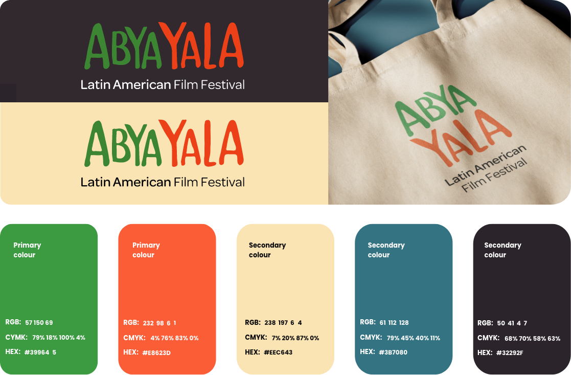
Abya Yala is a project created in Sudbury, in 2025 that explore Latin American roots through film, leading to the creation of the city’s first Latin American film festival. For this visual identity, each element was developed to evoke a sense of nature, community, and joy. The cultural roots were translated into a visual language that is both expressive and welcoming. The logo uses a bold, hand-drawn typeface inspired by Latin American heritage, evoking strength, nature, and organic imperfection through irregular, almost hieroglyphic forms. The color palette reflects the natural landscapes of the Americas, with green representing this connection and orange adding warmth, energy, and a human touch.

The creation of the poster evokes the union of Sudbury and Latin American culture through the depiction of the water tower, from which Latin American cinema emerges in the form of a film reel. This reel features hieroglyphic-like imagery that narrates the story of Latin America, symbolizing the connection and dialogue between these two cultures.
This project began with the creation of the Cinema logo, inspired by a film strip forming the letter “C,” capturing the expressive and rebellious spirit of classic cinema. The visual direction embraces bold typography, vibrant colours, and a vintage editorial style, standing apart from the rigid, monochromatic look of contemporary magazines. The identity integrates original photography to highlight Sudbury’s local creative scene, adding authenticity and a personal touch. The layout balances structure with experimentation, using rhythm, spacing, and colour, especially red, to create movement and reflect the energy of the film community.

The redesign of the logo for the renowned Canadian brand Old Vienna seeks to preserve its historical essence while reinforcing its medieval character. The concept respects the brand’s traditional audience of Canadian men between 40 and 70 years old, while introducing visual adjustments that broaden its appeal. The soldier’s shield from the most recent version of the logo remains the central symbol, while unnecessary elements such as the soldier figure and the double shield are removed to create a cleaner and more recognizable brand.

The color palette combines dark blue, representing history, tradition, and prestige, with yellow, a reference to beer that brings vitality and energy. Together, these elements reposition the brand toward a younger audience, between 25 and 40 years old, creating a more contemporary identity without losing recognition among current consumers.


Not your type? There's more fish in the sea.