Harven
Rody


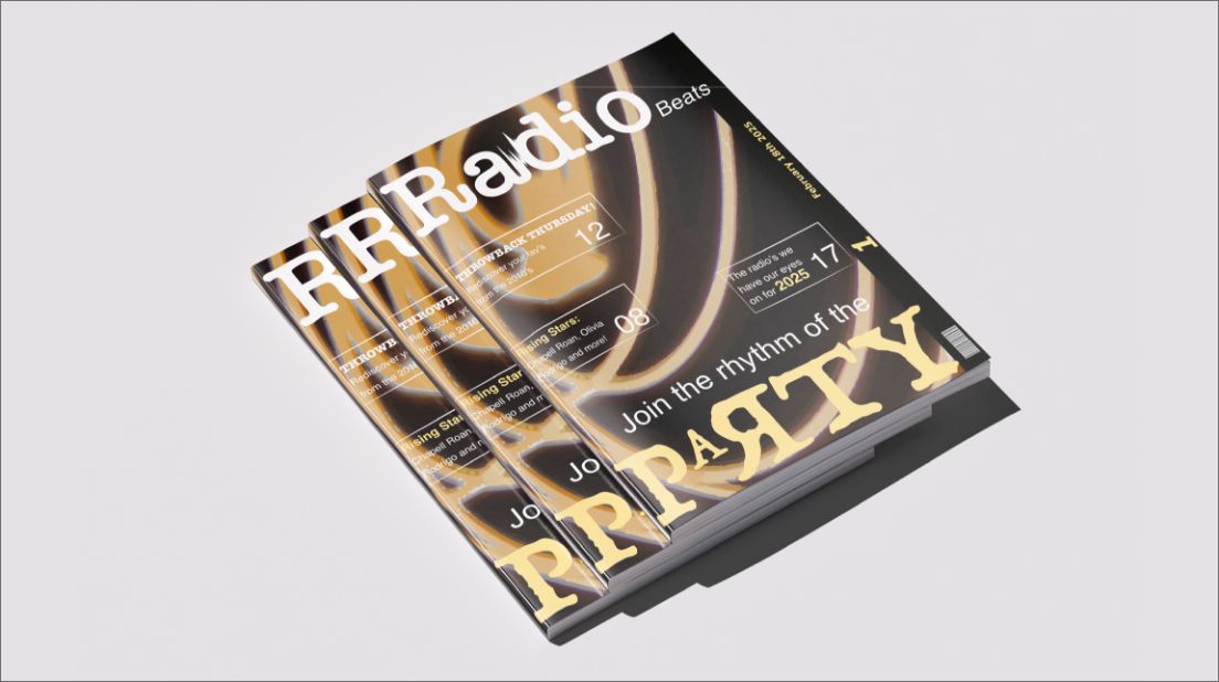
Radio Beats is a magazine about popular music and musicans. The goal of this project was to design fitting magazine speads that capture the audiances attention while informing about radios and music trends. This project included designing a cover, three spreads and a basic visual ID system for the magazine. The colours chosen represent the party atmosphere while keeping it modernly vintage.


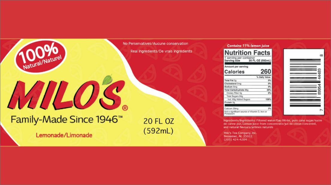
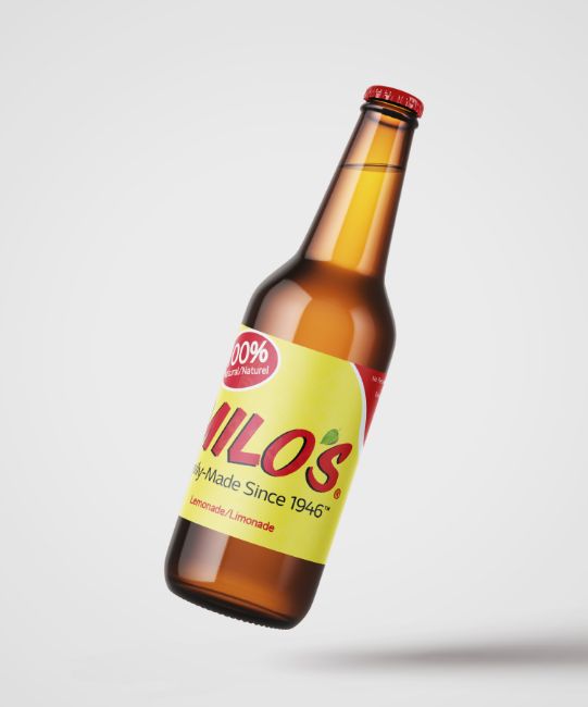
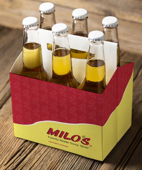
The Milo’s Lemonade packaging redesign project was aimed to update the can to a modern look while keeping in mind the product and brand identity. Lemon patterns were used throughout to help describe the product. The colours red and yellow were chosen to represent the brand colours as well as the colour of lemons. This project did not involve a logo redesign, as such the logo featured here is the company’s official logo.

Preserved:Vanished is a campaign about protecting and bringing awareness to endangered species with a focus on the Sloth Bear and Red Panda. The completion of a logo, basic visual identity, and illustrations brought this project to a close. The logo represents our goal of saving wildlife with the word preserved being forefront while vanished disappearing. The disappearing vanished also represents the hard reality of endangered species disappearing.


Not your type? There's more fish in the sea.