
Elizabeth
Horlings


This project is a packaging and visual identity expansion for Peace Coffee, reimagined as a canned ready-to-drink beverage. The objective was to translate the established brand into a new market space while preserving its recognizable voice and values.

By combining bold, large-scale typography with a vibrant colour system and playful illustrative motifs, the design creates strong visual impact and immediate shelf appeal. The composition emphasizes brand visibility, while the energetic palette reflects freshness, flavour, and a youthful audience. The result is a cohesive extension of the Peace Coffee identity that balances functionality with expressive visual storytelling.


Creatures at Risk is an awareness-driven visual identity project that addresses the growing issue of ocean pollution and its effects on marine wildlife. Through an educational and campaign-based approach, the project highlights the vulnerability of species impacted by human waste and environmental neglect.

The visual system uses ocean-inspired colour palettes, strong typographic hierarchy, and illustrative imagery to communicate information in a clear and accessible way. By balancing educational content with engaging visuals, the design encourages viewers to reflect on their relationship with the environment and the consequences of pollution on marine ecosystems. The project demonstrates how graphic design can be used as a medium for advocacy, awareness, and social impact.


This project is an Instagram carousel campaign created for Oreo, designed to engage users through playful, interactive storytelling. The concept encourages viewers to swipe through the post, revealing a sequence of visuals that highlight the product’s recognizable form and its association with fun and creativity.
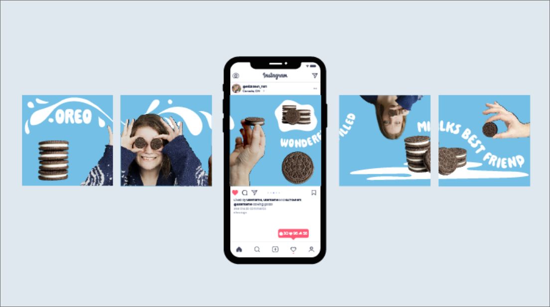
The design uses a cohesive blue colour palette inspired by Oreo’s brand identity, combined with bold typography and whimsical compositions. Elements such as stacked cookies, milk splashes, and hands interacting with the product create a sense of movement across the carousel, reinforcing the swipe-based experience. The inclusion of a central mobile mockup emphasizes real-world application and user interaction.


Not your type? There's more fish in the sea.