Kady
Jane
Peltier


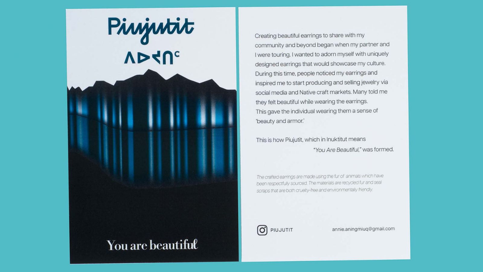
The goal was to develop a visual identity for Piujutit that aligns with the creation of the earrings and the emotions experienced by consumers while wearing them.

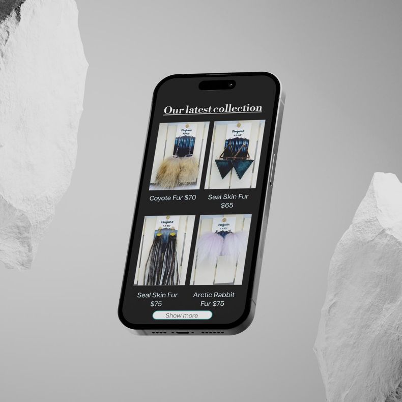
The intention was to create copy that would immerse the reader in visualizing the story behind the products. The illustration was designed to reinforce this concept, ensuring a seamless flow between the web and phone layouts.


Symbolism and meaning were incorporated into the design, creating a cohesive concept that beautifully unified all elements.


Velvet is a platform to showcase female makers reflecting their identity through each article and promoting their works by having a space for visuals to support the products they create. This would inspire creators to keep making by having a supporting customer base. This would also serve as a place to inform the people about new creators they may be able to experience. The magazine can be taken home, held, and experienced visually which would be pleasing for the consumer.

The project involved creating a magazine and masthead identity designed to attract the target audience. A basic 2-column grid was used, drawing inspiration from fashion and DIY magazines that focused primarily on the product.

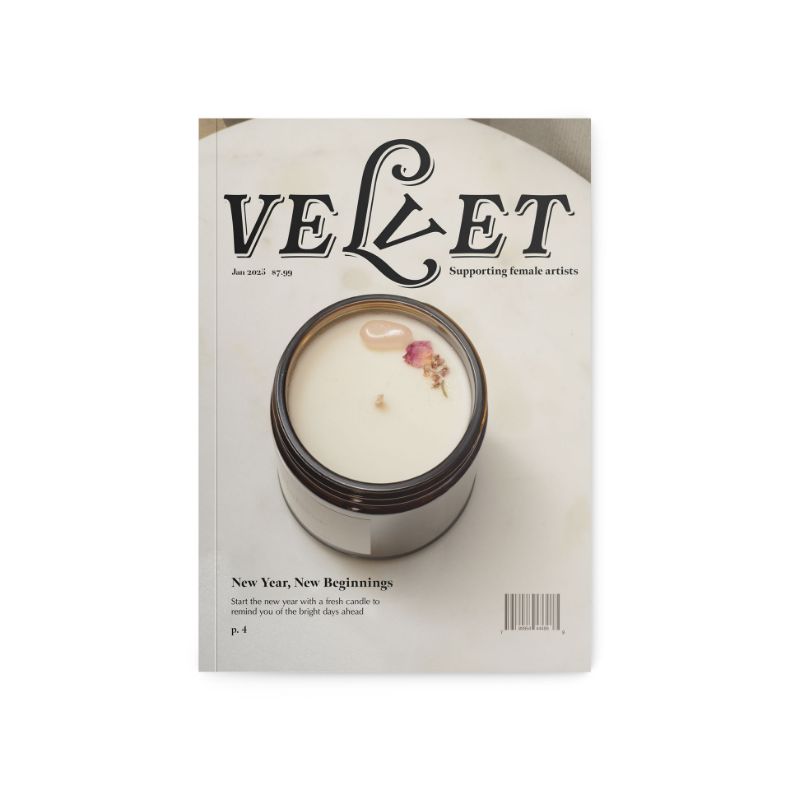
All photos were taken in an apartment using natural lighting, with minimal editing and color correction applied in post-production. Articles were written to introduce the makers, highlight the pieces being showcased, and provide contact information through social media or their website.


The concept was explored using a different approach to learning, focusing on expressive type rather than relying on pictures for the creation of a vibrant Native Language book.


This method offers a visually appealing and informative way to learn a new language, maintaining creativity without compromising the fun. Both printed and e-book versions are presented to provide an overall idea of how the book would look reproduced.

Through creative manipulation of type, the intention was to explore how the content would be perceived and read by individuals. Using 6-columns would allow the layout space needed for expression for each word as they are created differently in each chapter. Additionally, images were included to show how the campaign could be displayed in public, all while staying true to the book’s design.


