I tend to overthink my designs and focus on one element causing loss of unity throughout a project. Taking a step back allows me to focus on the whole project while making it easier to keep it consistent and unified.
I tend to overthink my designs and focus on one element causing loss of unity throughout a project. Taking a step back allows me to focus on the whole project while making it easier to keep it consistent and unified.
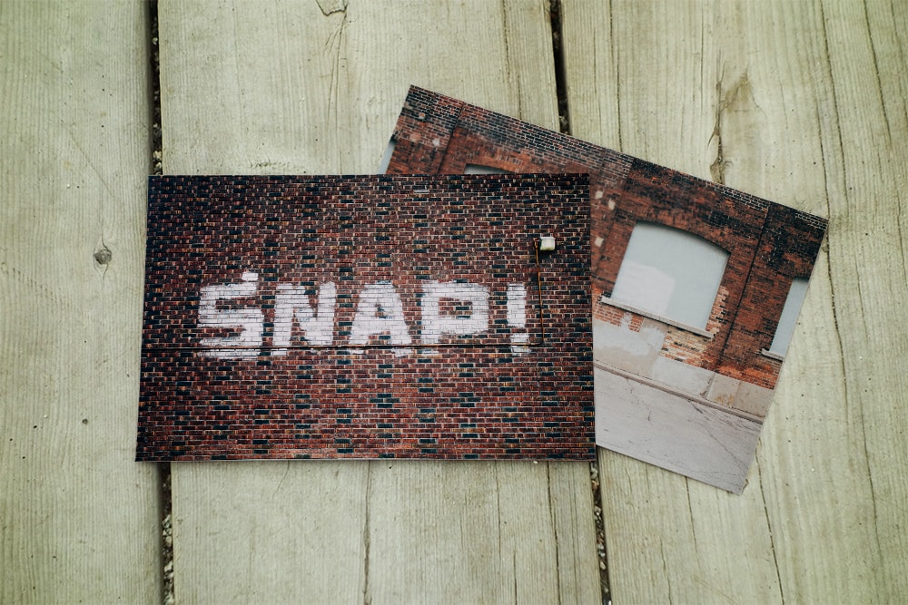
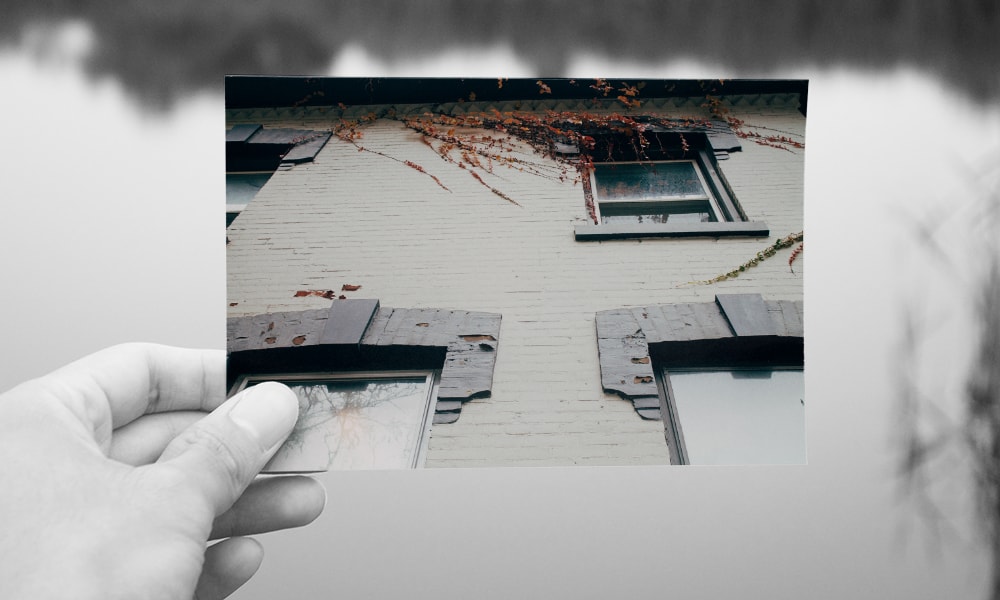
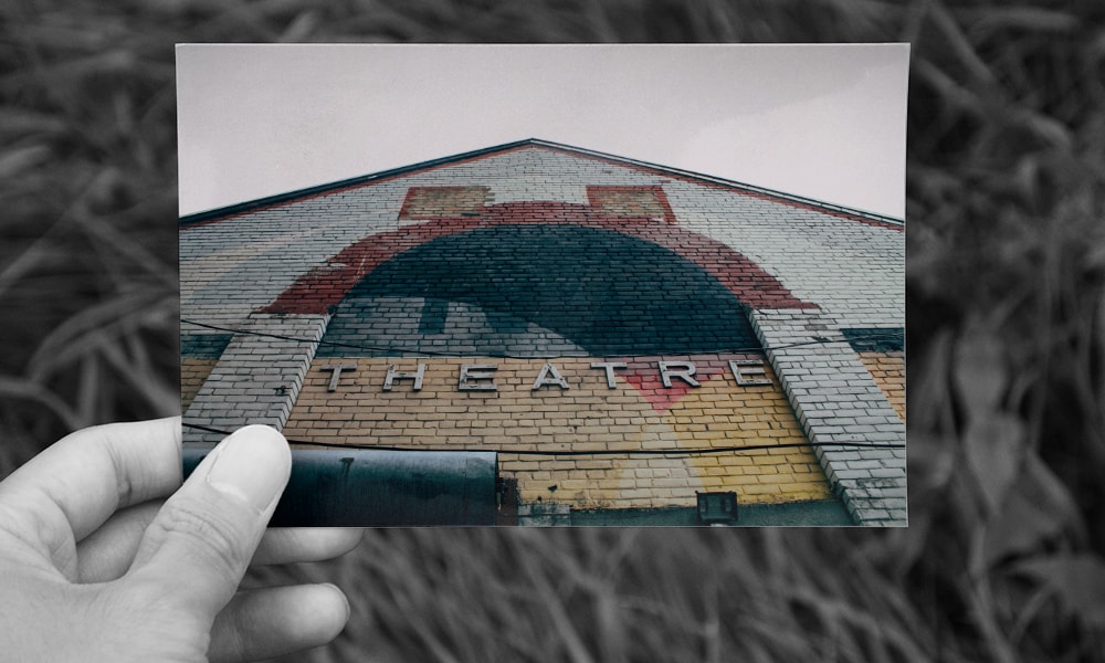
The idea behind this project was to take old decaying buildings and somehow show them in a good light. I took various shots of buildings in downtown Sudbury and Toronto.
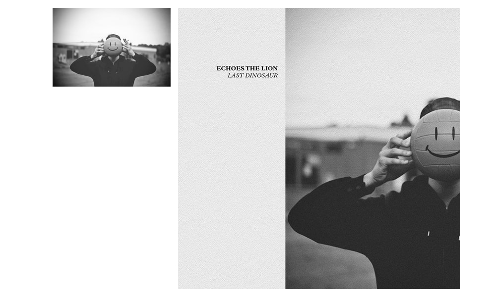
This album cover was designed for the local rock band Echoes The Lion, for their first EP. With a limited budget for production, I gave it a DIY feel and kept it black and white, thus allowing it to be printed on a standard copier.
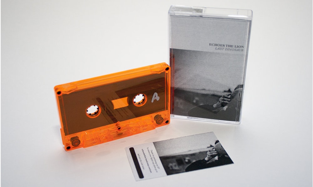
Once the cassette tapes went to production, the members of the band hand wrote and numbered the labels and inserts. Since digital music is the new norm, a download card is included.
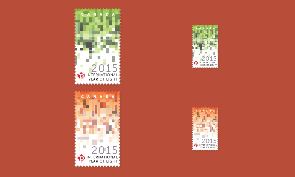
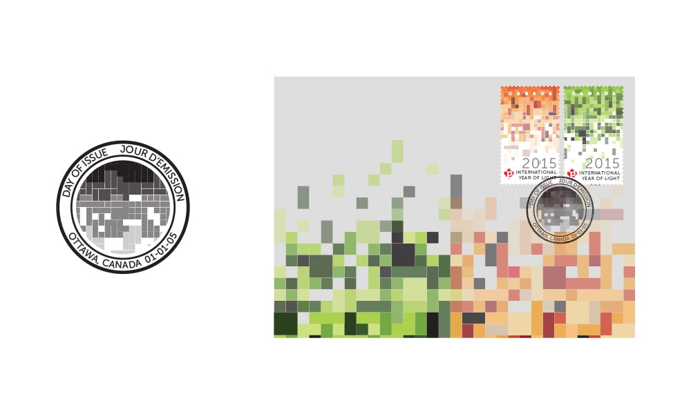
These stamps were designed to commemorate the United Nations International Year of Light. I decided to base the designs off of one of the most useful modern inventions, the Light Emitting Diode (LED).