This piece suffers by having a short-sighted concept and has some rendering issues. The places I decided to focus on were fleshing out a concept that stayed true to the establishment and fixing up the print and web design. To finish it off, the rendering of the mockups needed a serious overhaul.
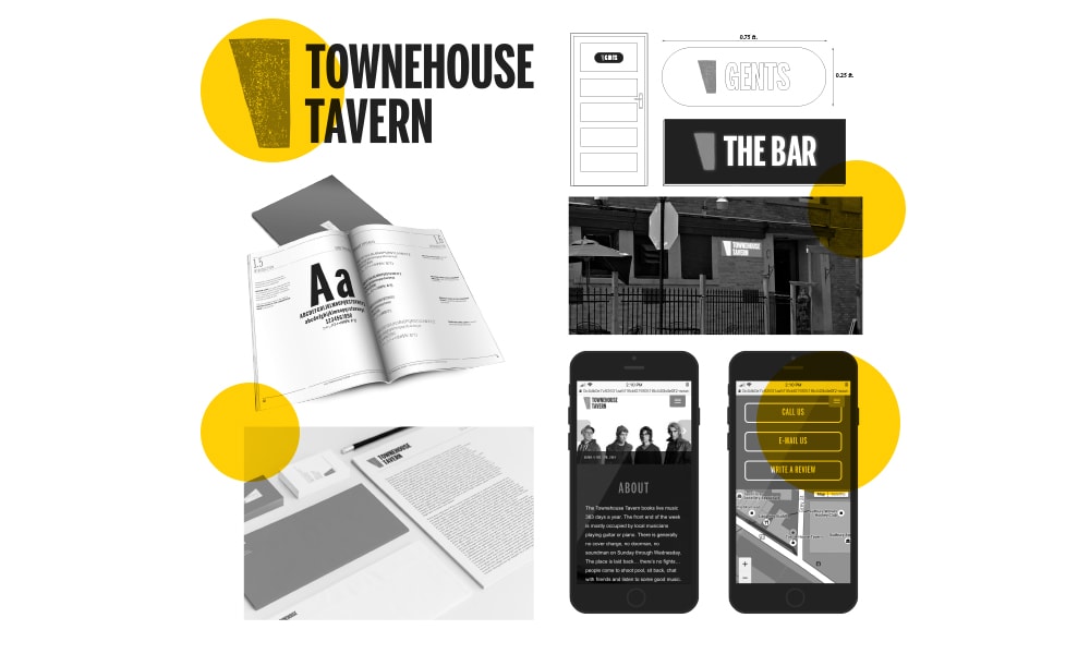
The Townehouse Tavern is a local bar that for years has struggled with having a real identity. It’s history as a biker bar in the 60-80s as well as the gritty atmosphere make it a great place to grab a bite and watch some live music.
For the past 30 years or so, the Townehouse Tavern has been a key player in the downtown arts and music scene and attracts people of all personalities. Therefore, the style needs to encompass the establishment whilst appealing to the arts and music scene.
Instead of using a symbol for the identity, I decided to go with a typographic approach and give it a humanistic, stamp like look. This aesthetic matches the chipped floor paint of the main stage where many musicians have made their mark.
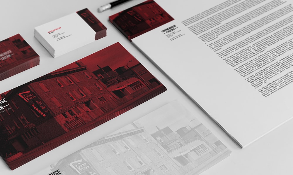
Using photos of the iconic building in print and advertisments compliment the starkness of the logo, while using red as a spot colour really makes it stand out. This decision was made due to the walls and flooring inside being a red-heavy colour scheme.
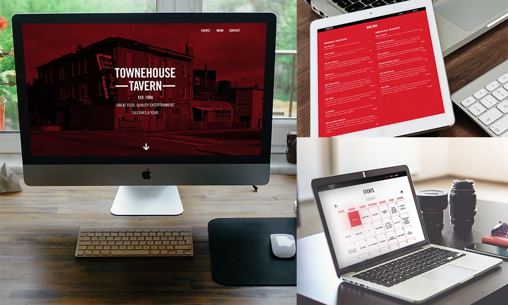
Paired with a fully functional, responsive one-page website (primarily used to see who’s playing or view the menu) that is well organized, visitors can browse and find out what events are coming up with ease.
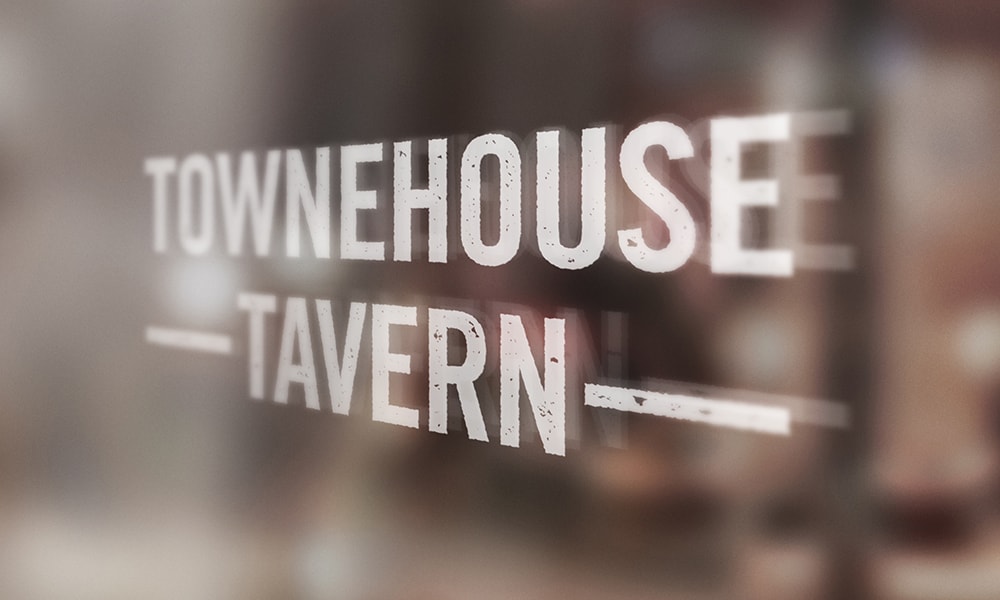
The building itself, located at the center of Elgin Street, is an iconic piece of Sudbury architecture. With that in mind, it wouldn't be a good idea to mess with the face of the building. Simple window graphics on the main windows and on the door would suffice.

